torsdag 29 september 2011

Make It Monday #34: Thick Chipboard Accents


THIS week, MIM at Papertrey Ink had some fun techniques: how to make your own very thick chipboard out of thin cardboard (= cereal box thickness).
This is what I made! :)
(Grattis means "Congratulations" in Swedish.)


---


DENNA vecka har MIM på Papertrey Inks blog lite roliga tekniker. Jag hade aldrig kommit på själv att man kan göra tjock chipboard från tunn kartong av samma tjocklek som flingpaket! Så smart! Så enkelt! Detta var vad jag tillverkade:


Supplies:
PTI dies: Bloom builder #3, Autumn Acorn dies
PTI stamps: Fresh Alphabet, Autumn Acorns, Leaf Prints
"Twigs" ribbon from May Arts "Ribbon Leaves"

---

söndag 25 september 2011

PTI Blog Hop - September 2011


MY second post today is showing my contribution to the PTI September 2011 Blog Hop:
I used the PTI set "Leaf prints" to make the background. I cut the leaves in strips and that's how I made the layered effect. Doily, ribbons and the little "happy birthday" stamp are all from PTI. The small "happy birthday" comes from my beloved "Tag-its #1" and happens to be my personal favourite on birthday cards. The inspirational picture we all used this month is this pic below:


Hope you enjoyed my card!

---

WMSC66 - Waltzingmouse Sketch Challenge # 66


WELL, I thought I'd have to participate in the WMSC. The sketch this week really appealed to me. Here is the result. I've been using the stampset "Back in the saddle" from Waltzingmouse stamps, as well as paper from Bo Bunny (12" whoo-ligans rahh - I used the back side!), Tim Holtz dies in plenty, Spellbinders and a button from PTI.


lördag 24 september 2011

October in September


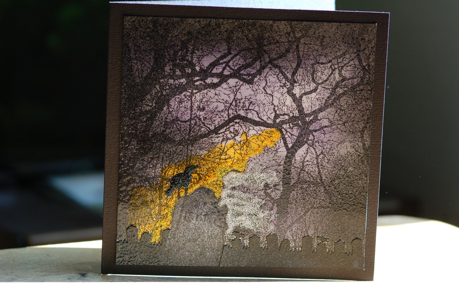
THIS time I wanted to create a Halloween card that shows how it normally looks here in Sweden on October 31st. We live just next to a graveyard and when I saw the beautiful stamp that covers a card at 
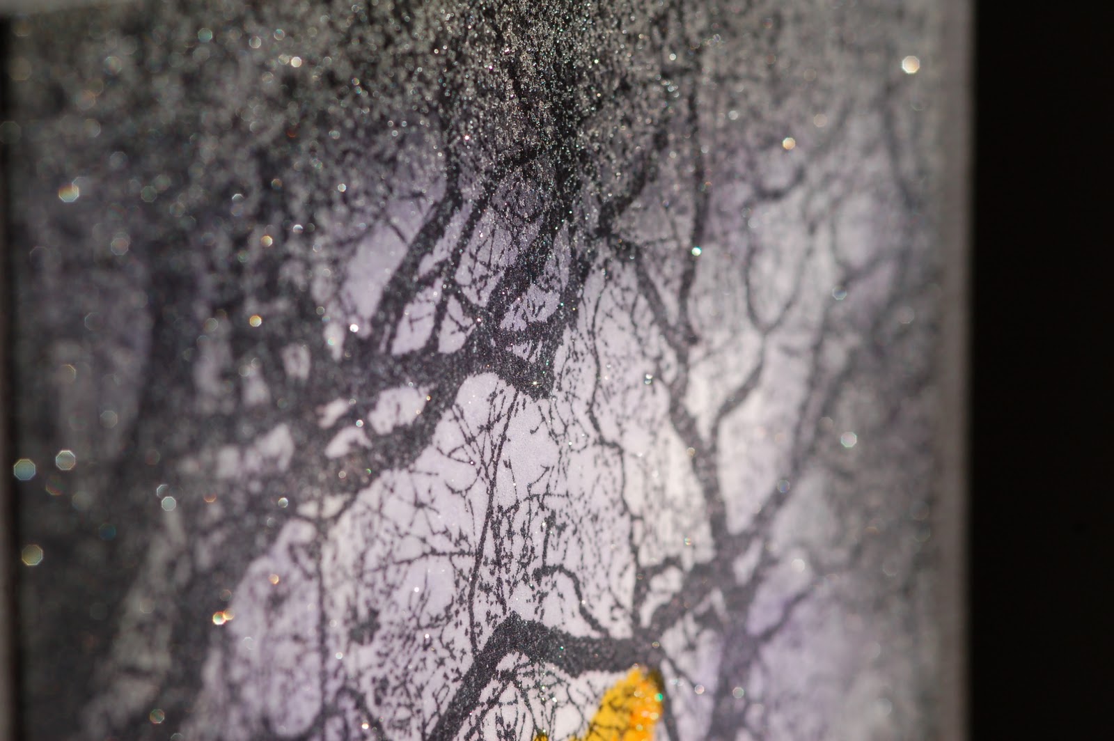
Scrapadabadoo I knew just how I wanted the card to look... Unfortunately, no matter how good the camera is, there is no way to show you just how cool the texture is and exactly how the sparkles mimic the first frost on the paved roads. (Feel free to magnify the pics!)
I love this new Goosebump texture spray!

---
JAG ville göra ett Halloweenkort som visar hur det brukar se ut i Sverige den 31:a oktober. (Jag har sett så många kort från andra sidan Atlanten med pumpor och höstlöv... men sent i oktober brukar det inte vara några höstlöv kvar på träden där vi bor...) 
Vi bor precis brevid en kyrkogård och när jag såg den här stämpeln från Scrapadabadoo visste jag hur jag ville att kortet skulle se ut. 
Tyvärr spelar det ingen roll hur bra kameran är - det finns ingen möjlighet att göra detta kort rättvisa. Jag har försökt att fånga struktur och skimmer, men det är omöjligt! 
Jag har använt mig av den nya Goosebump texture spray och effekten är faktiskt fantastisk. Skimret liknar den första frosten på asfalten! (Förstora gärna bilderna!)


Supplies: Black cardstock, Distress ink: Dusty Concord, Memento ink: Tuxedo Black, Goosebump texture spray (shimmer), Martha Stewart graveyard punch, Tombstone clear stamp from Inkadinkado, Branches cover a card stamp from Impression Obsession, stickles (frosted lace and spiced marmalade), copic markers.


söndag 18 september 2011

"Old" Steampunk Journal


FOR quite some time I've had this photo album almost done... I know: Just do it! Well, now I did. The difference between this photo album and my previous notebook from an older post, is that this one has black pages, it's bigger in size and thicker. If you magnify the pictures (-Please do!) you'll see much more details... On this one I used Perfect Pearl Mist (blue smoke and forever green) as well... I discovered that if you make a bigger metal area, like this book (5.5 x 8.5") you have to add more details and more colour shades to make it still interesting! I am not sure really why it is like that, but I guess it has to do with the fact that the eye always perceives bigger objects/areas different than small...

---

JAG har haft det här albumet på gång ganska länge... det var bara att sätta ihop det. Men ni vet hur det är, rätt som det är så får man annat att göra och det där sista blir inte gjort... förens nu! Skillnaden mellan det här fotoalbumet och min aluminiumtape-anteckningsbok (som jag publicerat tidigare) är att denna har enbart svarta sidor, är större och tjockare. Om man förstorar bilderna (Gör det!) så kommer ni att se att detta album har mycket mer detaljer. Jag upptäckte nämligen att om man gör en större bok så måste man ha mer detaljer och mer färgnyanser för att inte ögat ska tycka att den blir platt och ointressant. (Den här boken är 5.5 x 8.5 tum.) Jag är inte helt säker på varför det är så, men det borde ha att göra med det faktum att ögat alltid uppfattar större objekt och ytor annorlunda än små...