söndag 25 september 2011

WMSC66 - Waltzingmouse Sketch Challenge # 66


WELL, I thought I'd have to participate in the WMSC. The sketch this week really appealed to me. Here is the result. I've been using the stampset "Back in the saddle" from Waltzingmouse stamps, as well as paper from Bo Bunny (12" whoo-ligans rahh - I used the back side!), Tim Holtz dies in plenty, Spellbinders and a button from PTI.


lördag 24 september 2011

October in September


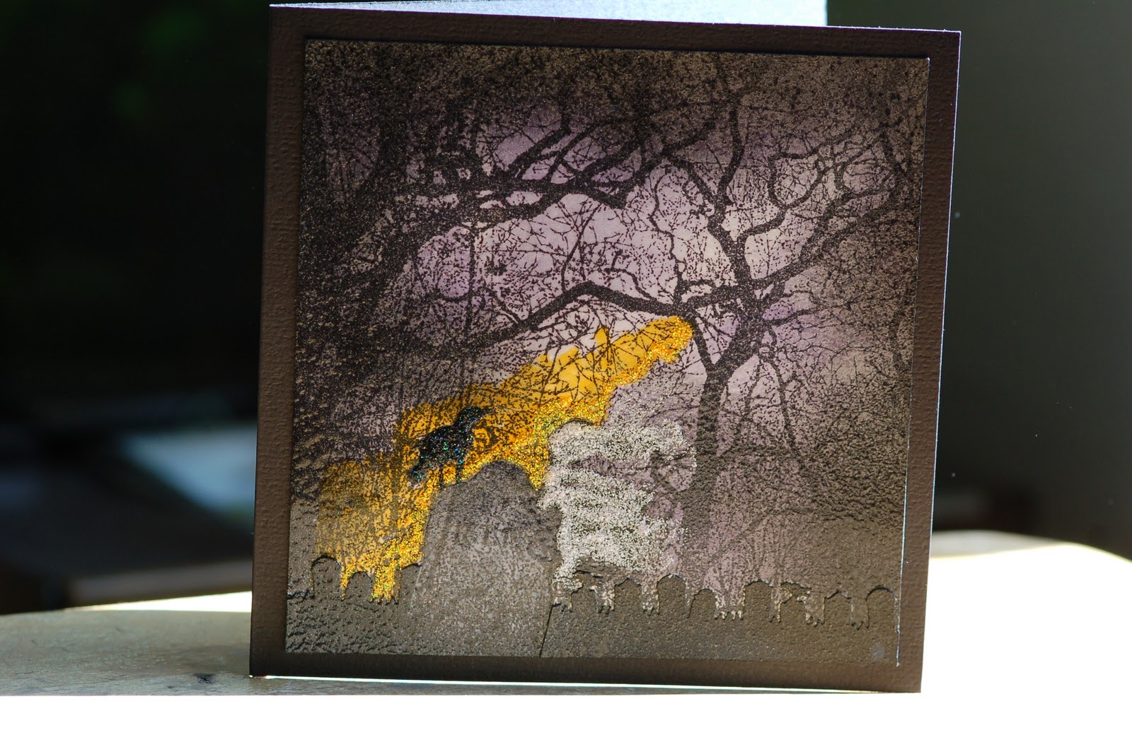
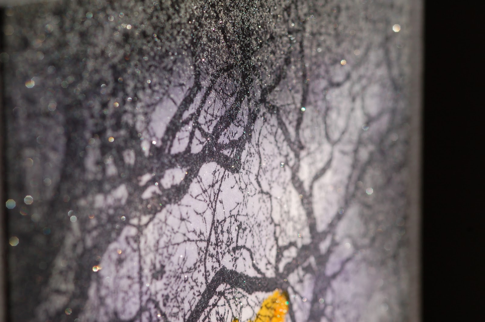
THIS time I wanted to create a Halloween card that shows how it normally looks here in Sweden on October 31st. We live just next to a graveyard and when I saw the beautiful stamp that covers a card at Scrapadabadoo I knew just how I wanted the card to look... Unfortunately, no matter how good the camera is, there is no way to show you just how cool the texture is and exactly how the sparkles mimic the first frost on the paved roads. (Feel free to magnify the pics!)
I love this new Goosebump texture spray!

---
JAG ville göra ett Halloweenkort som visar hur det brukar se ut i Sverige den 31:a oktober. (Jag har sett så många kort från andra sidan Atlanten med pumpor och höstlöv... men sent i oktober brukar det inte vara några höstlöv kvar på träden där vi bor...) 
Vi bor precis brevid en kyrkogård och när jag såg den här stämpeln från Scrapadabadoo visste jag hur jag ville att kortet skulle se ut. 
Tyvärr spelar det ingen roll hur bra kameran är - det finns ingen möjlighet att göra detta kort rättvisa. Jag har försökt att fånga struktur och skimmer, men det är omöjligt! 
Jag har använt mig av den nya Goosebump texture spray och effekten är faktiskt fantastisk. Skimret liknar den första frosten på asfalten! (Förstora gärna bilderna!)


Supplies: Black cardstock, Distress ink: Dusty Concord, Memento ink: Tuxedo Black, Goosebump texture spray (shimmer), Martha Stewart graveyard punch, Tombstone clear stamp from Inkadinkado, Branches cover a card stamp from Impression Obsession, stickles (frosted lace and spiced marmalade), copic markers.


söndag 18 september 2011

"Old" Steampunk Journal


FOR quite some time I've had this photo album almost done... I know: Just do it! Well, now I did. The difference between this photo album and my previous notebook from an older post, is that this one has black pages, it's bigger in size and thicker. If you magnify the pictures (-Please do!) you'll see much more details... On this one I used Perfect Pearl Mist (blue smoke and forever green) as well... I discovered that if you make a bigger metal area, like this book (5.5 x 8.5") you have to add more details and more colour shades to make it still interesting! I am not sure really why it is like that, but I guess it has to do with the fact that the eye always perceives bigger objects/areas different than small...

---

JAG har haft det här albumet på gång ganska länge... det var bara att sätta ihop det. Men ni vet hur det är, rätt som det är så får man annat att göra och det där sista blir inte gjort... förens nu! Skillnaden mellan det här fotoalbumet och min aluminiumtape-anteckningsbok (som jag publicerat tidigare) är att denna har enbart svarta sidor, är större och tjockare. Om man förstorar bilderna (Gör det!) så kommer ni att se att detta album har mycket mer detaljer. Jag upptäckte nämligen att om man gör en större bok så måste man ha mer detaljer och mer färgnyanser för att inte ögat ska tycka att den blir platt och ointressant. (Den här boken är 5.5 x 8.5 tum.) Jag är inte helt säker på varför det är så, men det borde ha att göra med det faktum att ögat alltid uppfattar större objekt och ytor annorlunda än små...


onsdag 31 augusti 2011

Another one of my dreamhouses...


I wanted to make a card that looks like it does now... It's the last day of August, and we don't have any autumn colours yet. You can still hang your laundry outdoors, but beware, it may start to rain! Even the rosebushes seems to bloom a second time...

Oh, and I used a fun technique that I invented! First I stamped the house on the white paper with Memento Tuxedo Black, the second time I stamped the same stamp a little bit lower but in London Fog. Then I got more depth in the image! I coloured the house with my Copics and that's about it! Just click on the picture to magnify it - you'll see the effect on the boards! I think it turned out pretty cool!

---

Jag ville göra ett kort, men ha med färgerna som är utomhus just nu. Inte direkt som förra kortet, alltså! 
Jag hittade på en ny teknik för att få lite mer liv och djup i brädorna:
Först stämplade jag mitt vita papper med Memento Tuxedo Black och lite, lite lägre stämplade jag exakt samma hus igen, men nu med London Fog. Klicka upp huset i full förstoring så ser du effekten på brädorna! Jag tyckte att det blev ganska coolt! (När grunden var klar målade jag huset med mina Copics.)


Stamps: PTI "Boards and Beams", "Hanging out", "Leaf prints", "My Punny Valentine"
Die: PTI Picket Fence
Patterned paper: Flower blooms by Pink Paislee (2011), scraps from my leftovers...
Copic markers

Inks:
Memento Tuxedo Black, London Fog, Bamboo leaves
Versa Magic Jumbo java
Distress ink Walnut stain

Lace: Prima
Distress crackle paint: Picket Fence (!)

söndag 21 augusti 2011

Fall/Autumn/Höst


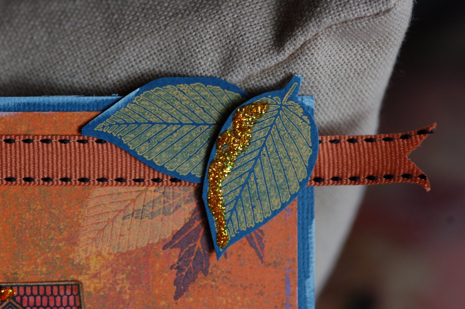
School has started and the weather is getting colder. I find myself in the beginning of my favourite season. No falling leaves yet, (I hope that waits until the end of October,) but I still thought I could start enjoying the wonderful colours yet to come...
---
Skolan har börjat, det är inte lika varmt ute längre och jag har på något sätt hamnat i min favorit av årstiderna. Vi har inga fallande löv här än (jag hoppas att det inte händer förrens i slutet av oktober), men jag tänkte att jag skulle kunna börja njuta av höstens färger redan nu...


Paper: Dracula (Eerie collection) by Basic Grey, dark blue cardstock, white 4CC paper.
Stamps: Leaf prints, Boards & Beams, 2009 Autumn Tags - all by Papertrey Ink.
Other: orange ribbon, stickles from Ranger and Copic markers.
---
Papper: Dracula (Eerie collection) från Basic Grey, dark blue cardstock, vitt 4CC paper.
Stämplar: Leaf prints, Boards & Beams, 2009 Autumn Tags -  alla från Papertrey Ink.
Övrigt: orangefärgat band, stickles från Ranger och Copic markers.


torsdag 18 augusti 2011

I'm a Big Cheese winner!

"And our Big Cheese for this week, a showstopper from Elisabeth Larsson!

A classic! Pairing Vintage Ornaments with the backdrop of Festive Foliage, Elisabeth has created a gorgeous holiday card. I love the addition of the glitter on the branches and the perfectly-placed rhinestones. And that pop of purple again for Christmas! Maybe we can convince Lynn to make that one of the Christmas Card Challenges! Thank you for sharing your fantastic creation, Elisabeth"

WOW WOW WOW!

söndag 7 augusti 2011

The first Christmas card of 2011/År 2011s första julkort


A Christmas card in August?! Well, I had to try out my new WMS stamps and spellbinder die, right?
---
Julkort i augusti? Jag var ju tvungen att testa mina nya WMS stämplar och Spellbinder die, eller hur?


Stuff used: Kraft cardstock, WMS Festive Foliage, WMS Vintage Ornaments, Spellbinder Heirloom Ornament dies, stickles "frosted lace", Distress ink "Frayed Burlap" and silver bling stones.
---
Använda grejjer: Kraft cardstock, WMS Festive Foliage, WMS Vintage Ornaments, Spellbinder Heirloom Ornament dies, stickles "frosted lace", Distress ink "Frayed Burlap" och silver bling stones.


-